I recommend reading through the design discussion (or at least the Executive Summary) below before jumping into the interactive prototype. Typically data tools require a bit of context and training before the first use.
The Problem
Administrators of data systems often have to import data files or accept data from third-party systems. Import cuts down manual data entry, but data is rarely clean or current. This results in conflicts in records. Resolving these conflicts is typically a tedious process of finding and manually fixing conflicts. However, algorithmically merging has considerable risks involved. Typically, resolving conflicts requires a person's approval to ensure data integrity. It's also a relatively risky task because most databases join records in a destructive manner. Once the submit button is pressed the records are forever together.
Intended User
HR staff that administer a large corporation's employee management system.
This Concept
This interface concept demonstrates a method for merging duplicate records when importing data from a file or another data system. In this example, a user imported an Excel file of employee information. There are multiple suspected duplicate employees. Duplicates without differences can be merged at the click of a button or en masse. Those with differences—maybe "Bob" versus "Robert" or a transposed number in a employee number—will require walking the user through a guided merge process. The result is a process that helps the user feel comfortable the resulting data is clean by providing feedback and transparency through the entire process. Despite being a manual process, the interface gives a clear path and empowers the user to quickly make informed decisions. Typical merge operations are destructive, but this method (through a hypothetical, probably NoSQL database) creates a new version of the employee record linked to the previous two, so that merging/separating can be non-destructive. Thus, a user can abandon or undo work as needed through the workflow.
Note: The interactive prototype is intended to demonstrate interactions. This demo does not save information between pages, either client-side or in a database. It is purely to provide an overview of a interface solution to common data system workflow. Refreshing pages or using the back button will not remember state as a real application would
Executive Summary (tl;dr version)
- Users sees a list of suspected duplicate records with percent match. User can merge 100% matches and resolve conflicts.
- Users sees a quick overview of conflicts between the records they are merging.
- Users resolve conflicts in a guided process by using mouse, touch, or keyboard.
- The final merged record is shown before saving it. The merge can be undone immediately or at a later date.
Overview

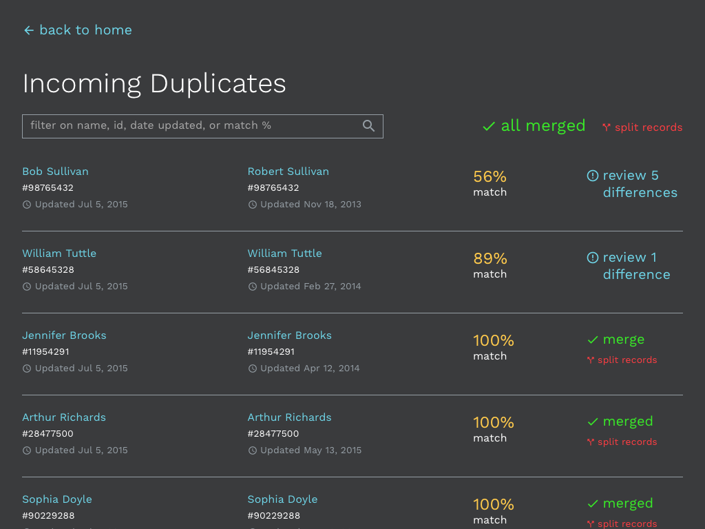
The process begins with flagging suspected duplicates on import of data. There are a lot of technical assumptions made about matching algorithms, but it is less relevant to the end user experience at this point. Percent match shows the overlap of key demographics (first name, last name, date of birth, social security number, etc.). 100% matches are separate records with identical information. These are safe to batch merge, by clicking merge all 100% matches button. This is low risk activity from a data integrity standpoint because no data is being lost or overwritten. Each merge in the batch can be individually undone or the whole batch can be undone by clicking the split records buttons.
However, for Bob Sullivan and William Tuttle there are differences that need to be resolved. The user can click review differences button to go forward.
It is possible that the 100% merges could be completed automatically by the system as long as proper feedback is given to the user and opportunity for forgiveness is provided. The user should have veto power over any automatic merges.
Check the Duplicates
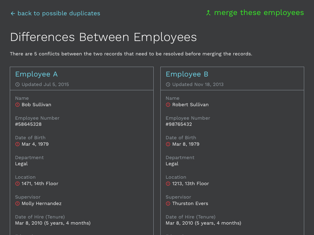
Once a suspected match is selected all of the conflicts are laid out with the rest of the information about the employee. The conflicts are highlighted with the alert icon. It's important to put the conflicts in context of the whole employee record to give context for the conflicts.
This step is a quick check to make sure the user wants to actually merge the clients. Going back to the list of possible duplicates abandons the match. Clicking merge these employees button continues on in the workflow. This step was not in early drafts of the interaction, but it provides needed feedback and transparency before launching into the guided merge process. This step prevents the situation of a user going through most of the conflict resolution process only to realize she wants to abandon.
Merge the Clients

At this step the user chooses the information to retain for the final merged employee. The specific labels A and B really don't matter terribly (they could be 1 and 2) because it is more about which information is correct. Though, users may opt for the most recent pieces of data, which is why the updated date for records is seen throughout.
The user can use the keyboard (A and B keys select the record and advance to next comparison) or mouse to select the correct employee information to retain. The user gets visual feedback on their selection, as well as progress toward their goal via the progress bar. There is a slight delay in advancing to give the user an opportunity to see the selection. The user can then move backward or forward with next and previous buttons to verify or update a selection. The entire experience is designed for focus, delivering feedback to the user, and progressing the user toward their goal.
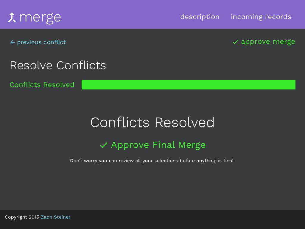
I had an important choice to do the merging on one screen (for example on the previous overview page) or as a guided task. An early, abandoned iteration had toggle arrow buttons in between each conflict that the user could click to point to the correct information (it was fast, but also a little too "clever"). For a handful of conflicts (< 4 or so), there did not seem to be a big difference between a one page and guided workflow. However, the more conflicts the user must resolve the all at once method could be overwhelming, increasing the likelihood of missing a conflict. The guided resolution solution allows a focused comparison of each conflict, while still retaining a fast interaction. The interaction adds a bit of friction to help prevent errors in data entry without adding so much friction as to slow the user down.
The guided interaction could be easily expanded to a three-way conflict or allow for a "Both" card. The both option could be useful for conflicts where an employee can have multiple email addresses or phone numbers that need to be retained.
What about an "Apply All to This Employee" checkbox? I considered including checkboxes to apply all conflicts to A or B. This is common practice in batch operations, like copying duplicate files in Finder or Explorer. "Apply all" buttons work really well until you have the exception and then it can be very difficult or impossible to backtrack. In this interaction, it did not seem to speed the workflow sufficiently to warrant the potential for errors. It is almost as fast for the user to click or hit A repeatedly, but still gives the user control of the whole process.
Finalize the Merge

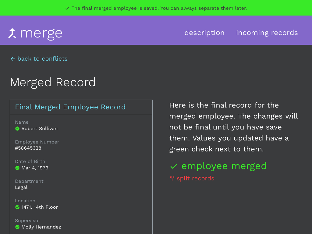
To provide transparency, the final step provides the user feedback on their work before submitting it. The pieces of information about the employee that were created from the merge are highlighted with the checkmark icon. The user can return to resolve conflicts, if something does not look correct. In a real app, it could be useful to click on a resolved piece of information to return directly to the relevant conflict merge screen. This way the user could quickly fix a mistake without having to go through the entire series of conflicts. For instance, clicking "Robert Sullivan" would return to the screen where the user could alternately select "Bob Sullivan". If the merged record doesn't look right, the user can abandon the whole merge without consequence.
Clicking the save merged employee button creates a new "Robert Sullivan" record and the two original records are linked to it. The user can also undo the merge immediately by clicking the split records button.
What happens if data is added or changed on the new record? How would a user separate these records? Assuming that history is tracked on all records (as it should be!), each entry in the history would need to be attributed to "Robert" or "Bob" (our two original records). Using the same card comparison interface, the user can quickly attribute the new or changed information to its respective record. The record created for the merge is tag deleted and the "Robert" and "Bob" are now separate and back in the wild.
Technical Information
This concept was built with HTML, CSS3, JavaScript/jQuery, and SVG. Works in modern browsers that support SVG and Flexbox. Browser support aided by Autoprefixer.
Grid system is Bourbon Neat. The demo is responsive, so phones are welcome.
Typeface is Work Sans. List filtering is provided by List.js. Icons are from Material Design Icon Set.
Source Code is available on Github.